10:00
Data science lifecycle & Exploratory data analysis using visualization
Research Beyond the Lab: Open Science and Research Methods for a Global Engineer
Feb 29, 2024
Email from GitHub?
While we are getting ready, please check for this email from GitHub and accept the invitation to join the GitHub organisation for the course. Used Gmail to sign up? Check the folders that aren’t your primary inbox (e.g Updates).

Other sources for help
- Posit Community Forum: https://community.rstudio.com/
- Documentation websites: https://ggplot2.tidyverse.org/
- Mastodon tag: #rstats
- Quarto GitHub Discussion: https://github.com/quarto-dev/quarto-cli/discussions

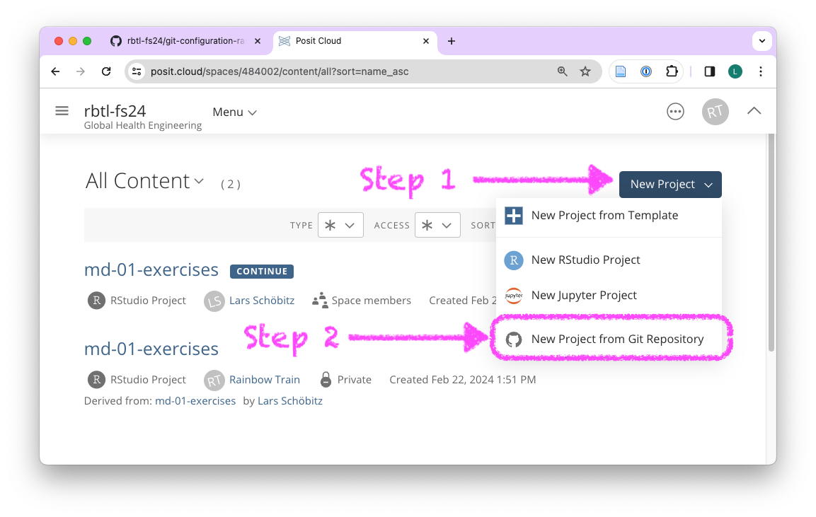
open GitHub organisation
Bookmark this link in your browser!
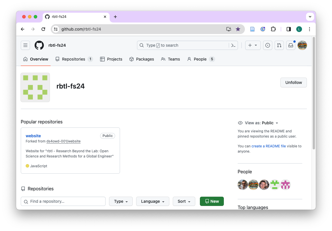 ## on GitHub Organisation
- Search for your username in search bar under Repositories
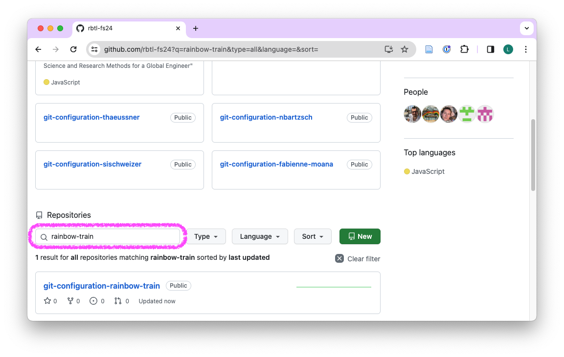
on your repository
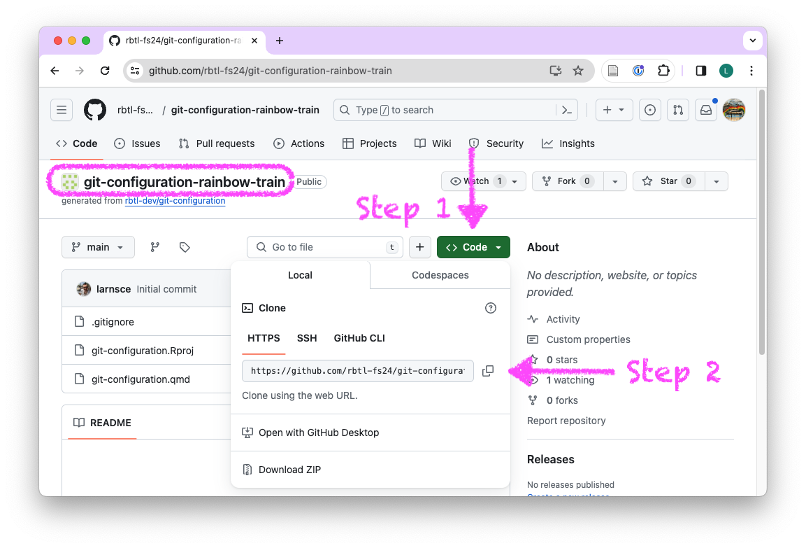
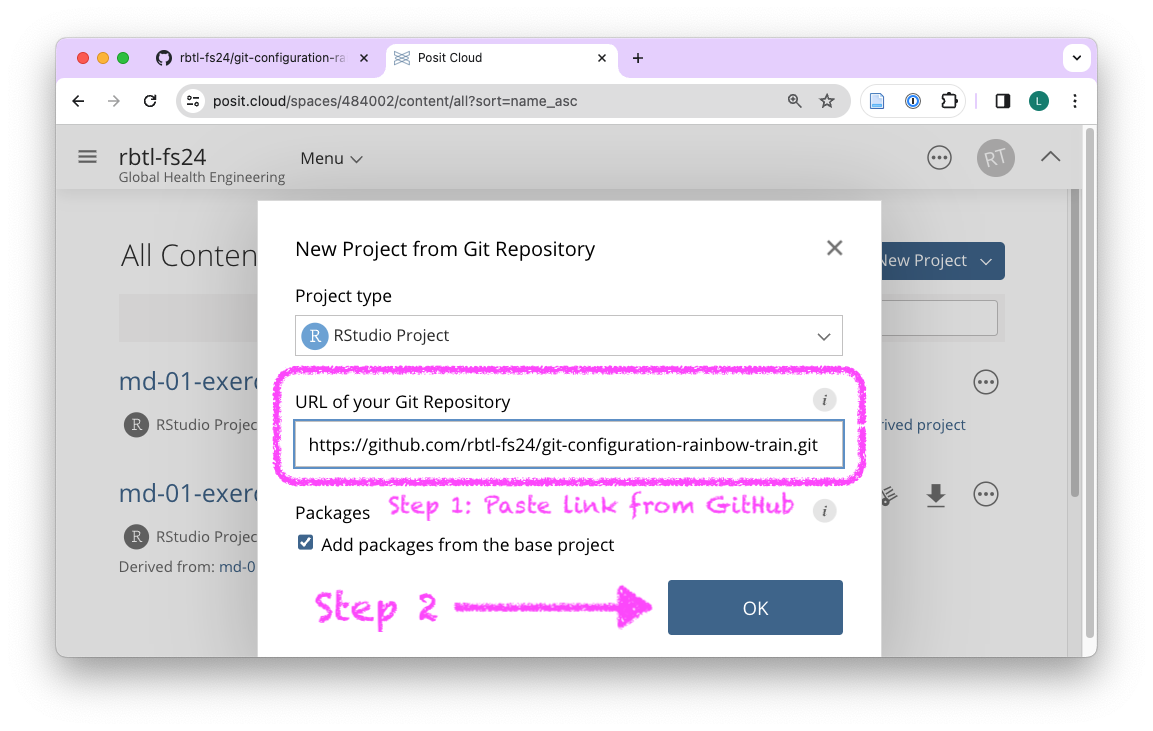
on Posit Cloud
Bookmark this link in your browser!
on Posit Cloud
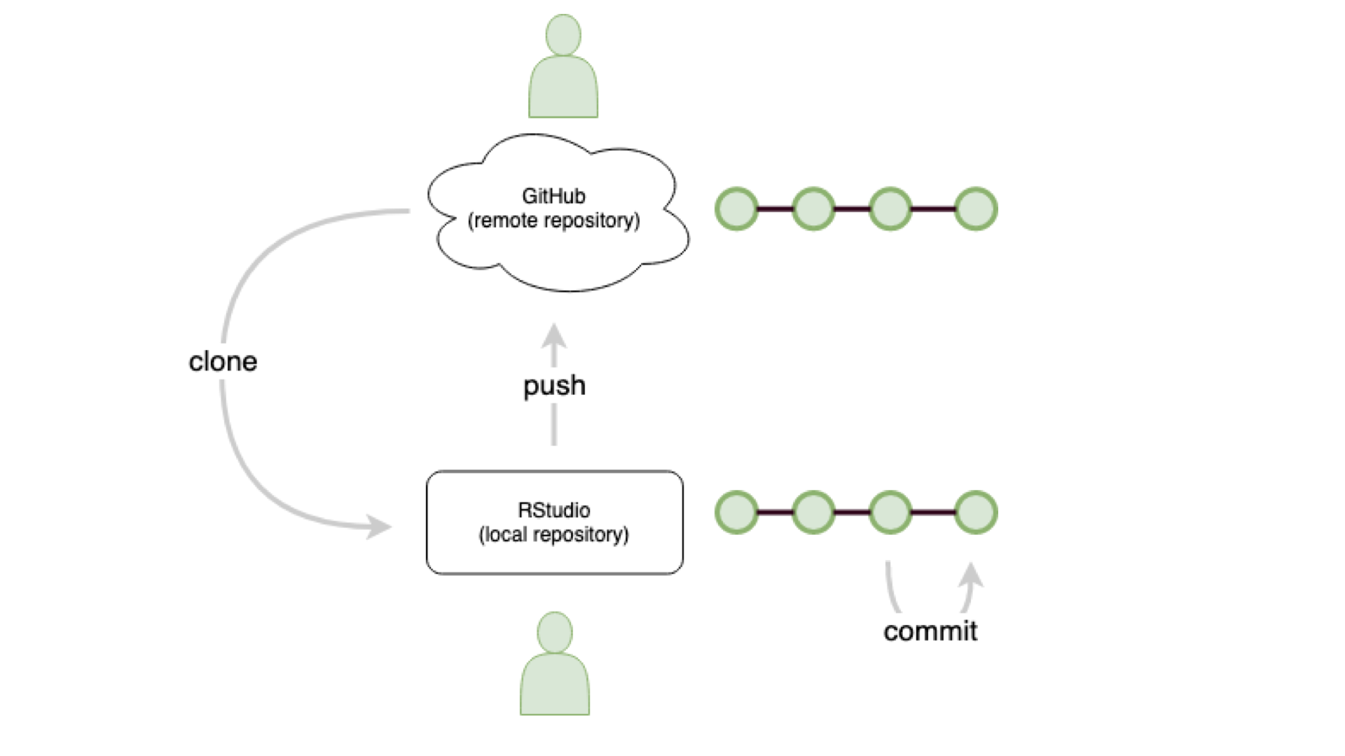
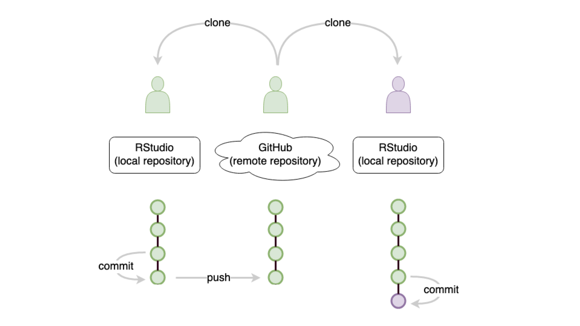
remember: git commit

remember: git push
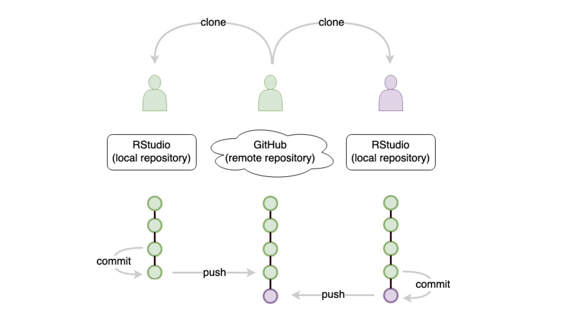
remember: git push

collaborate: git clone
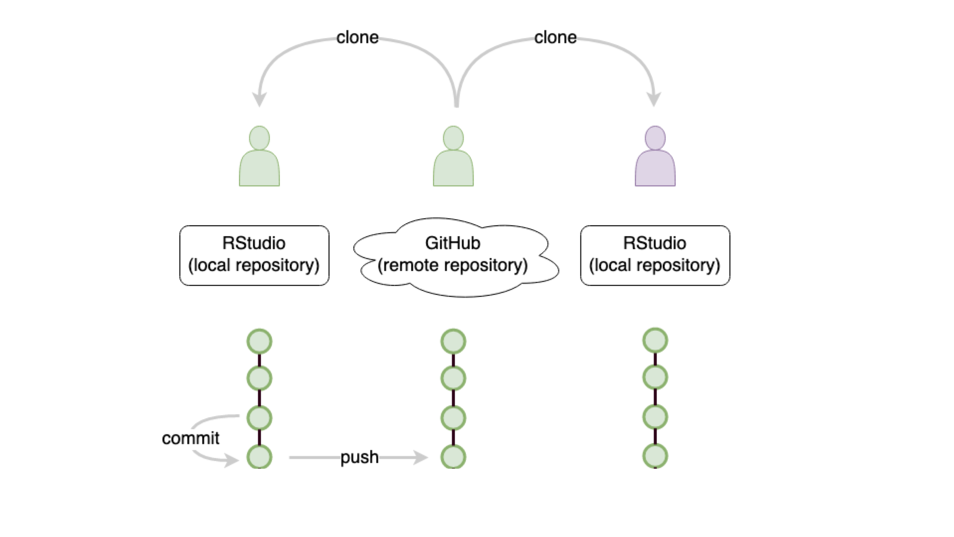
track work: git commit
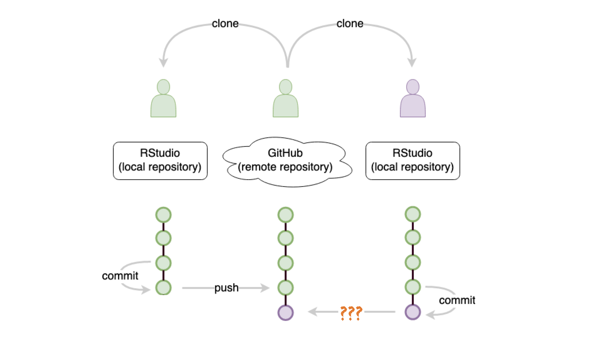
update: git ???
update: git push
git ???
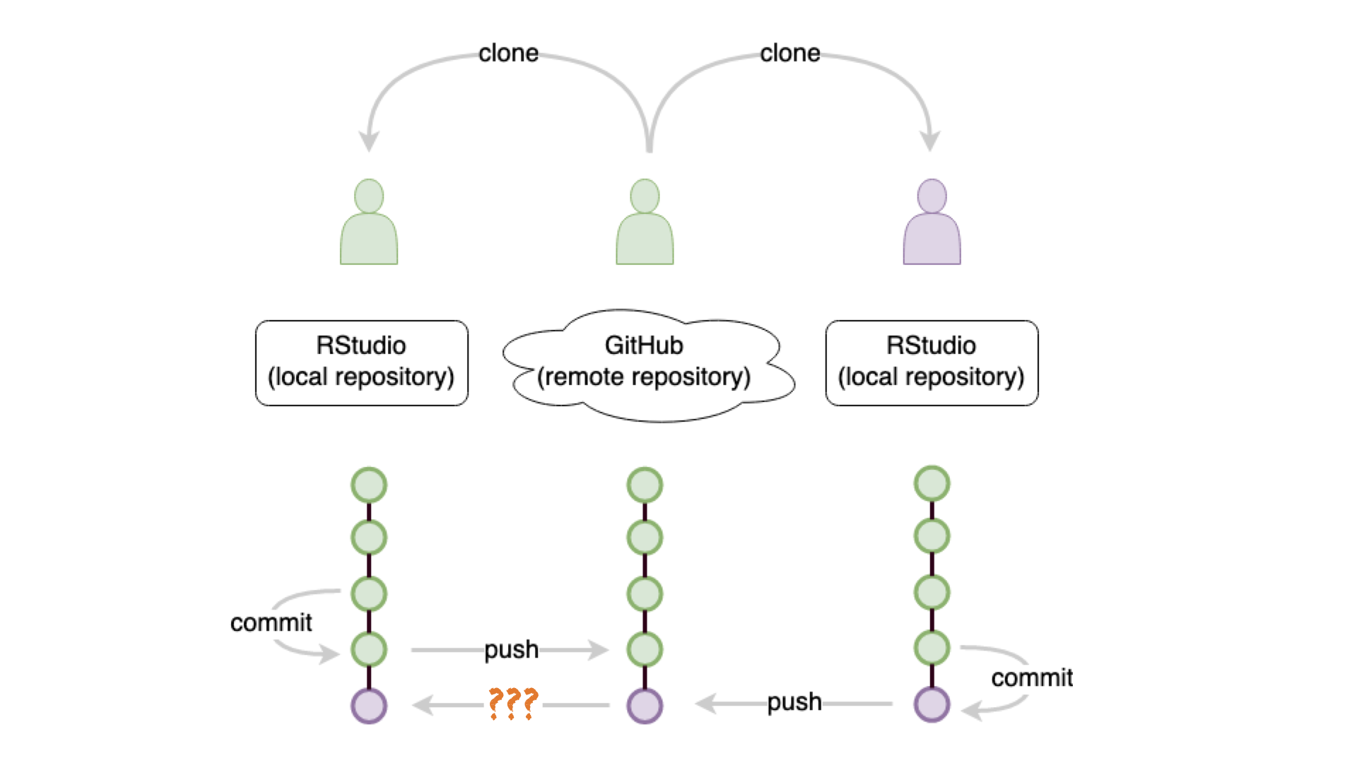
get updates: git pull

R Package ggplot2
- ggplot2 is tidyverse’s data visualization package
gginggplot2stands for Grammar of Graphics- Inspired by the book Grammar of Graphics by Leland Wilkinson
- Documentation: https://ggplot2.tidyverse.org/
- Book: https://ggplot2-book.org
Take a break
Please get up and move! Let your emails rest in peace.

10:00
Code structure

Code structure

Code structure

Code structure
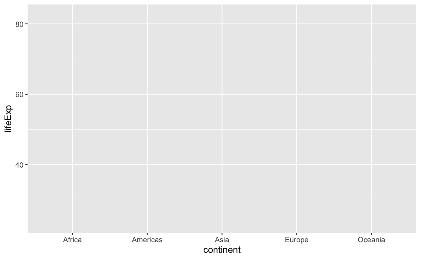
Code structure
Code structure

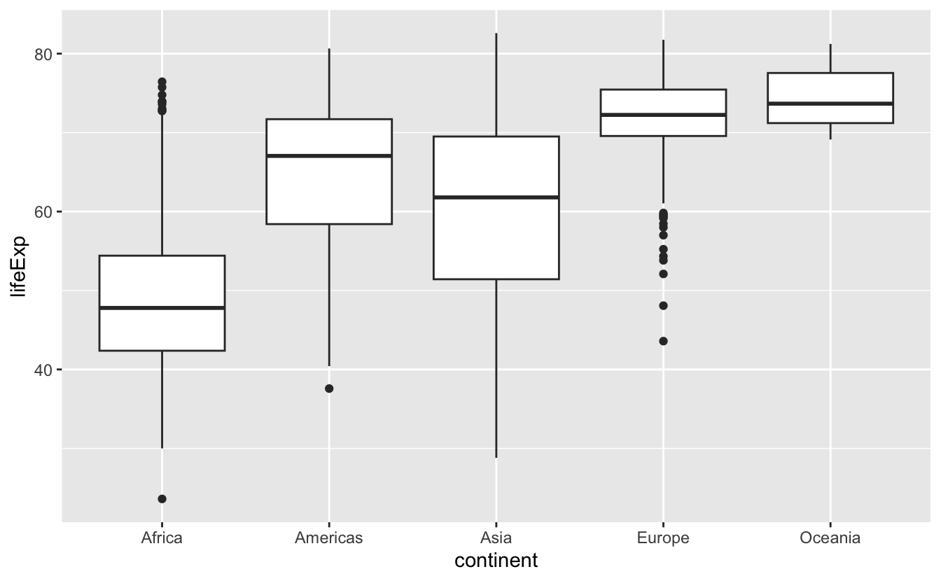
Poll 1: What does the thick line inside the box of a boxplot represent?
- I don’t know
- the mean of the observations
- the middle of the box
- the median of the observations

Poll 2: What percentage of observations are contained inside the box of a boxplot (interquartile range)?
- I don’t know
- 25%
- depends on the median
- 50%
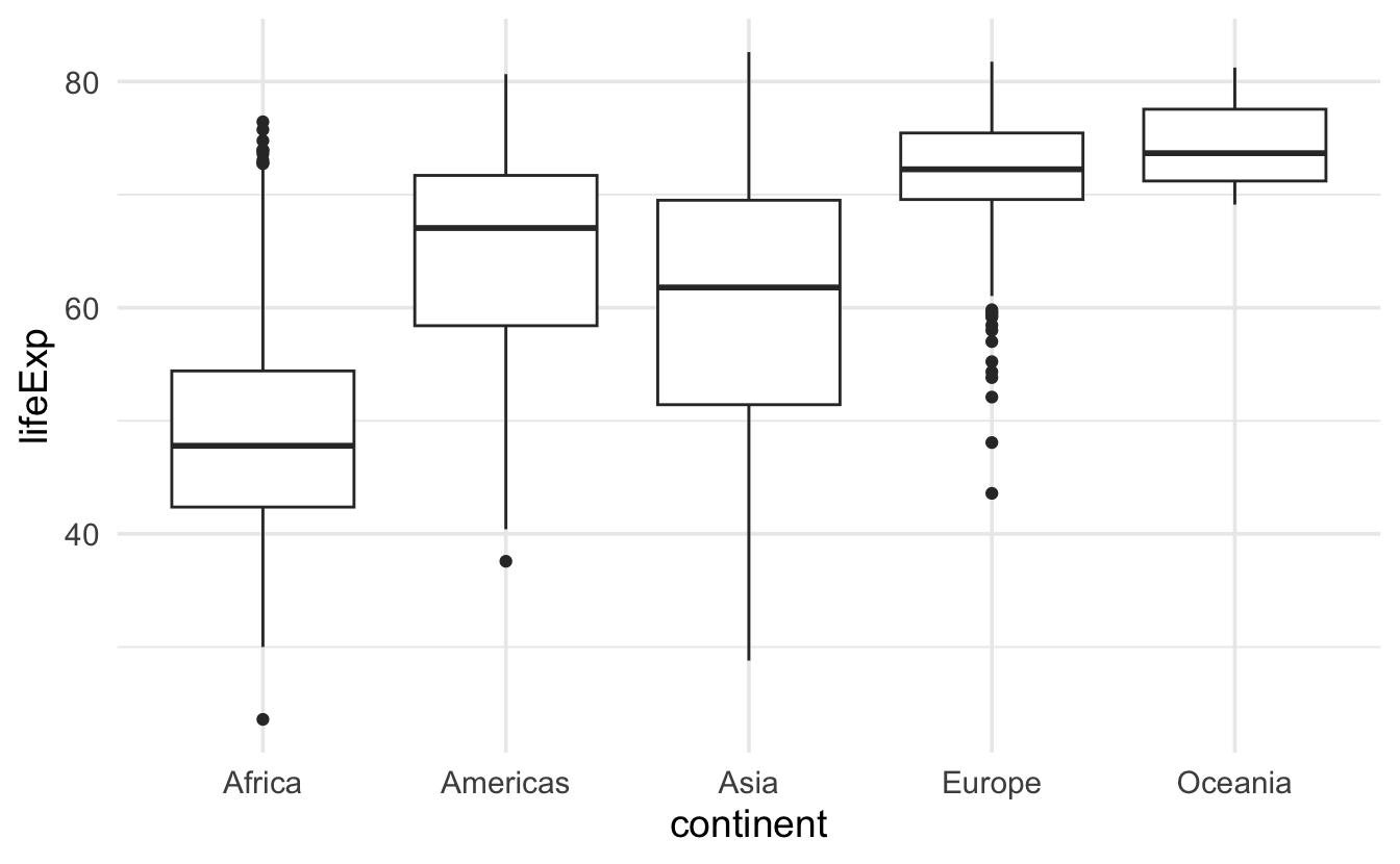
Boxplot, explained
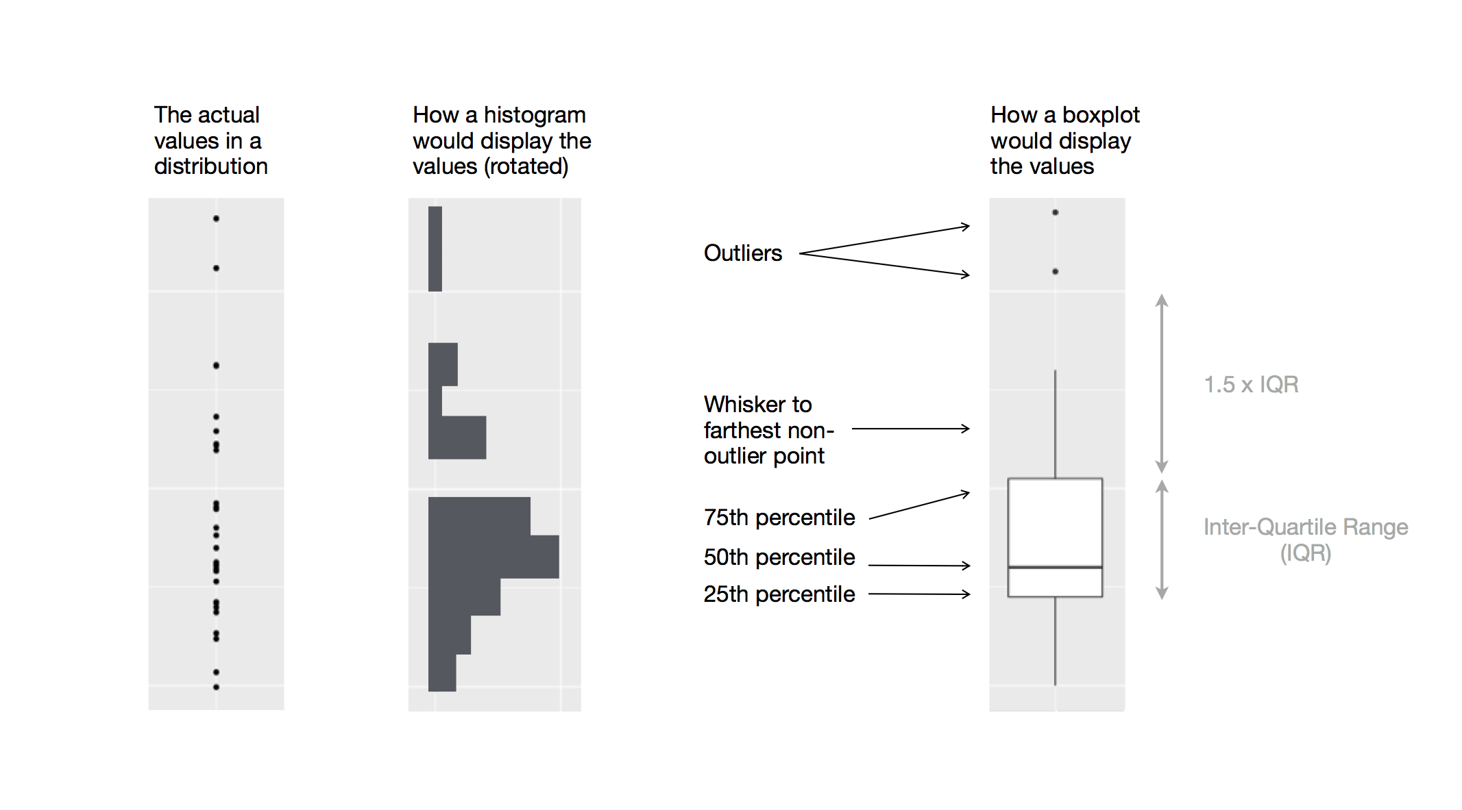
Figure 1: Diagram depicting how a boxplot is created.
Take a break
Please get up and move! Let your emails rest in peace.
10:00
Histogram
- for visualizing distribution of continuous (numerical) variables

Barplot
- for visualizing distribution of categorical (non-numerical) variables
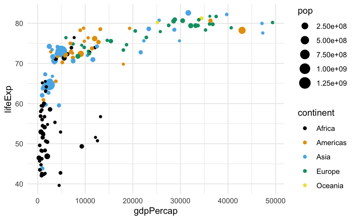
Scatterplot
- for visualizing relationships between two continuous (numerical) variables